
Brand illustration & AI workflow
On Brand Illustrations in Ten Minutes, by Anyone
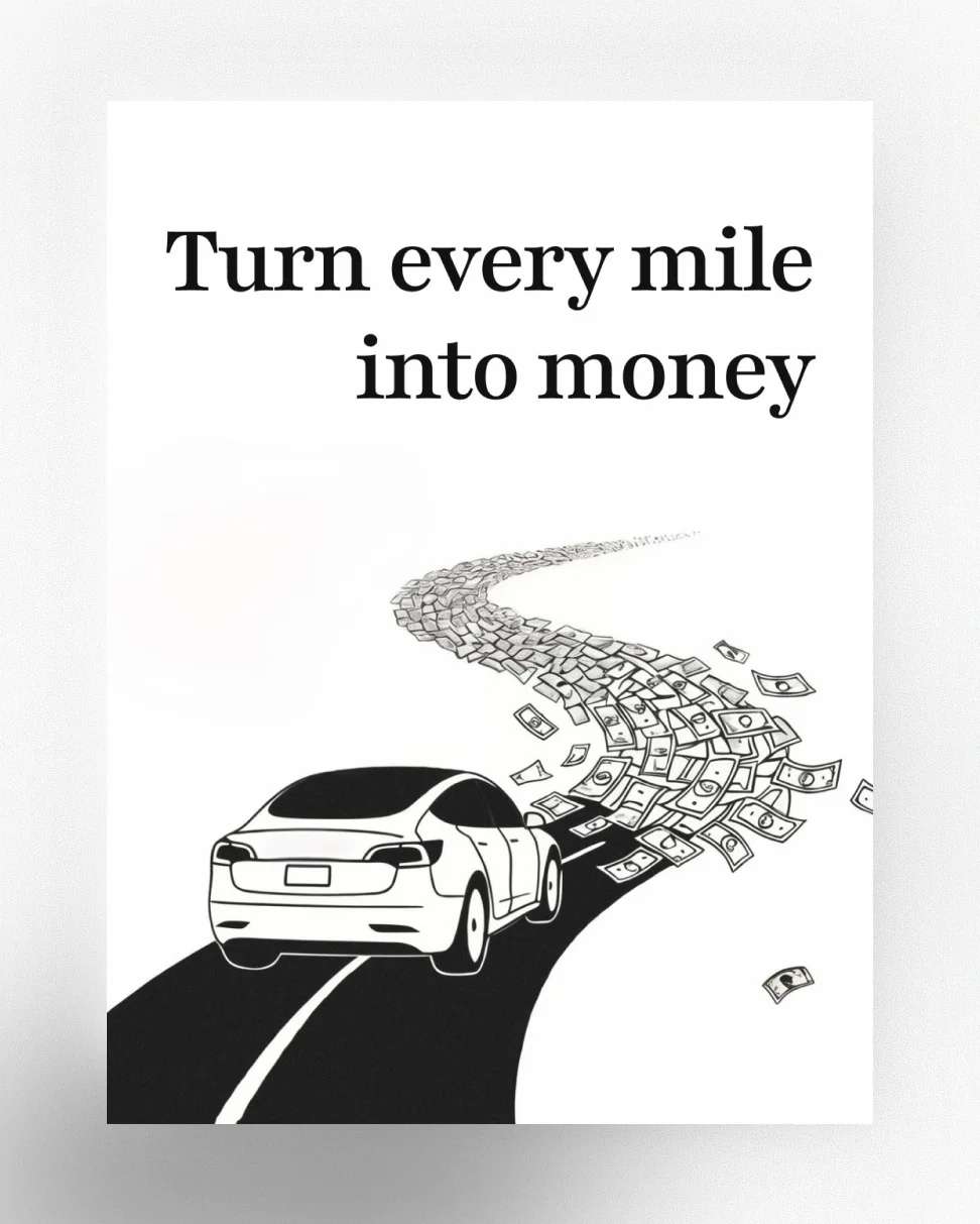
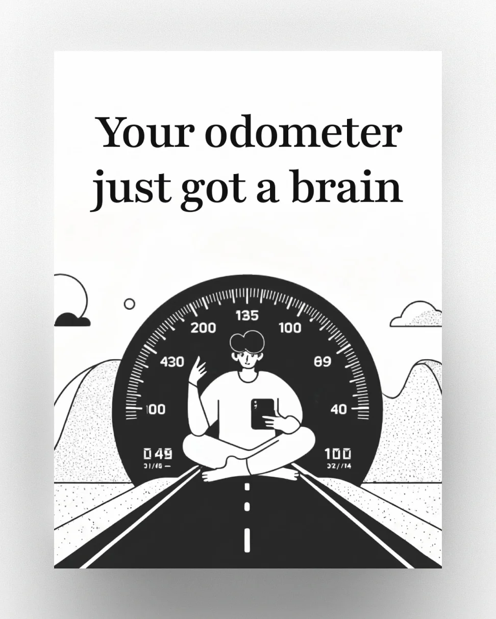
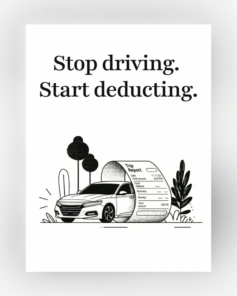
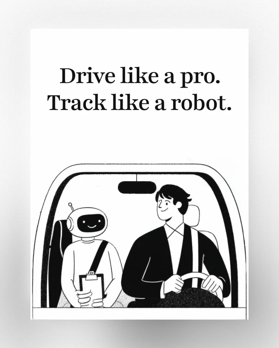
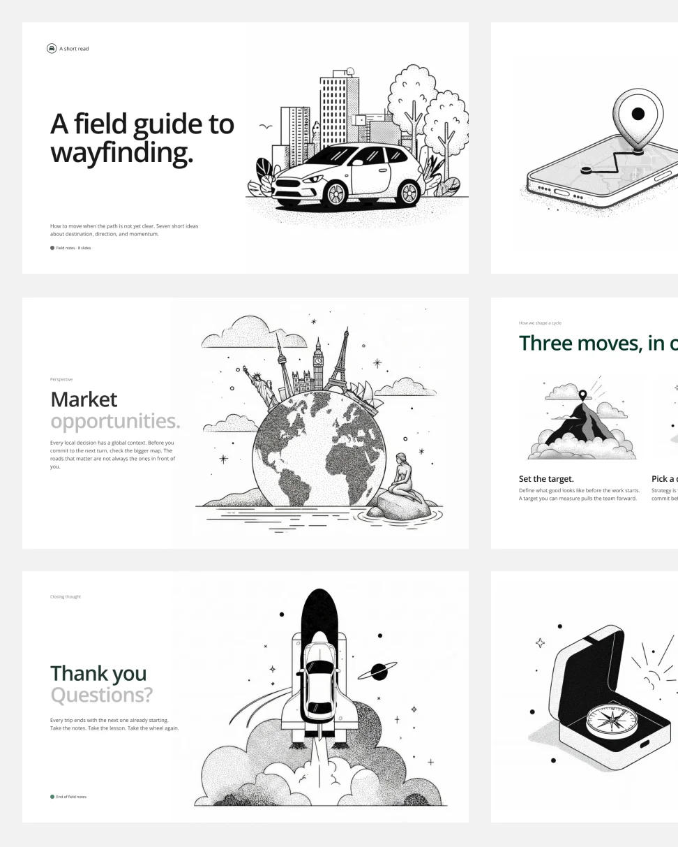
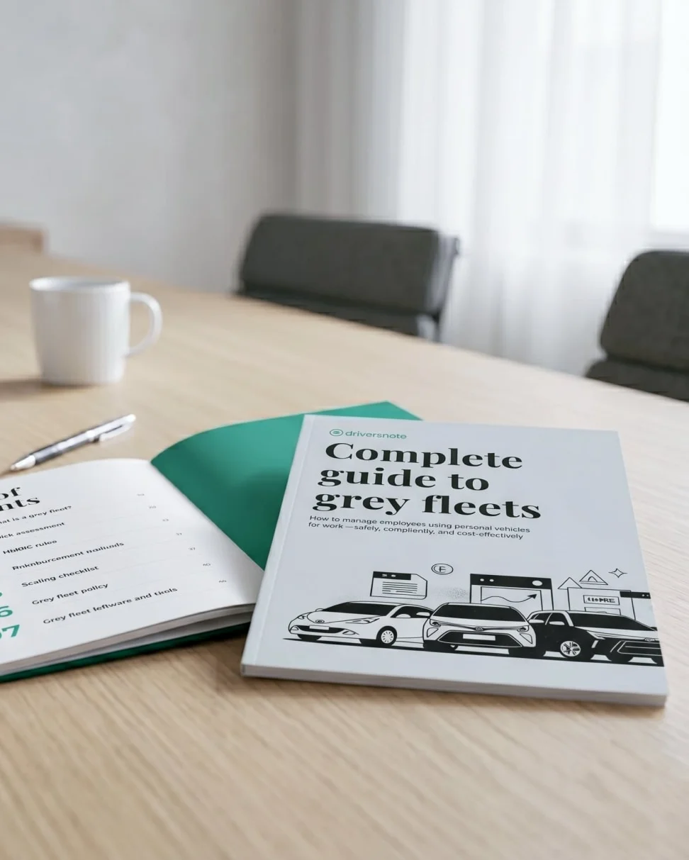
Only product designers at Driversnote could make brand illustrations.
It took days per asset. Results drifted with whoever made them. Nothing was documented.
I led the project, holding workshops at each milestone, and built a system anyone could run.
An Illustration Spec the Brand Should Have Had All Along
The brand had a typography spec and a colour spec; illustrations had drifted because nothing constrained them.
I broke a customer sentiment, "Mature Simplicity Built on Trust & Accuracy," into four characteristics: aesthetic tone, form language, colour and light, character design. Aesthetic tone was clean, calm, competent; characters were adult. The four characteristics did for illustration what the type spec had always done for type: bound the choices.
Those four characteristics filtered every illustration that followed.
The Sweet Spot Between Brand Fit and Production Speed
The rules narrowed the field, and Midjourney still returned thousands of plausible answers.
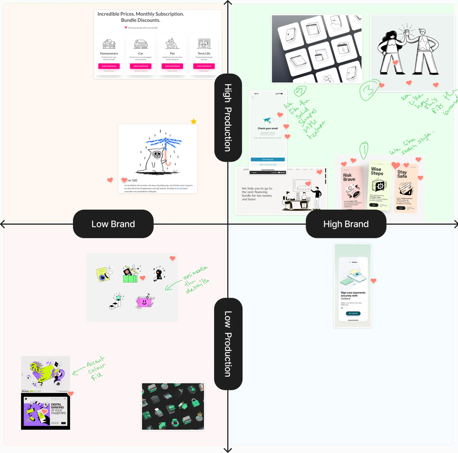
I mapped tone to surfaces, with expressive for marketing, balanced for empty states, and functional for in-product. The team plotted references against a second axis of brand alignment versus production effort and dot-voted the survivors. I built the workflow around ten minutes: an expression level, three Midjourney runs, a Figma pass.
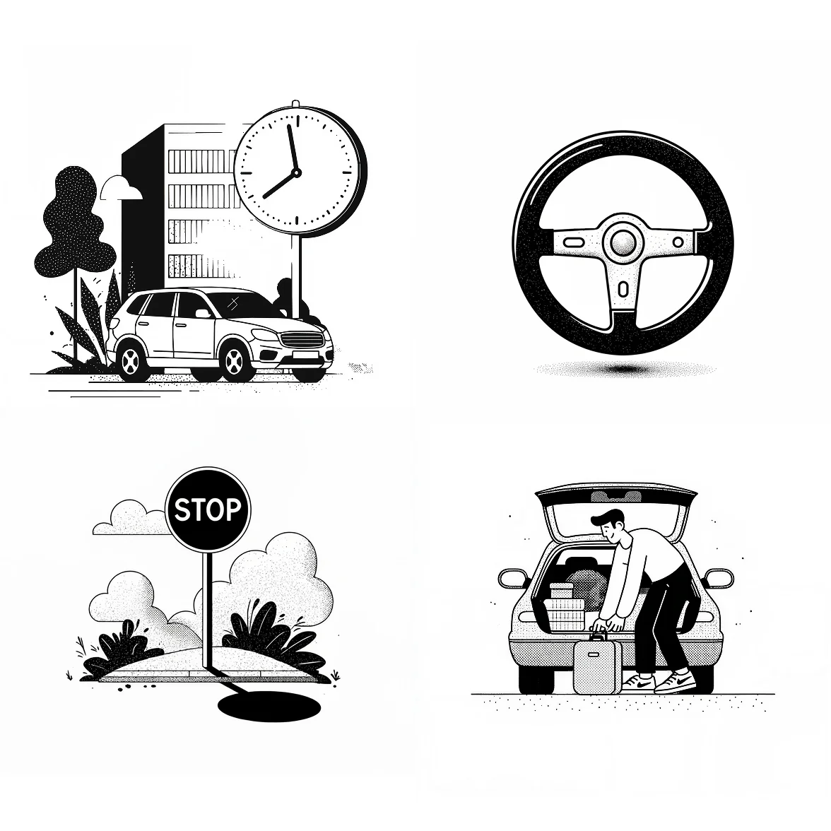
The search resolved to a single style reference code, written into the shipped quick guide.
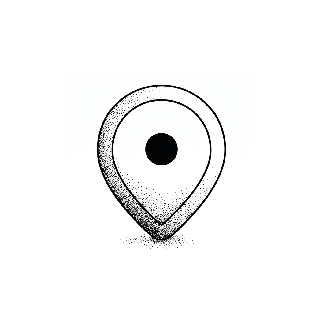
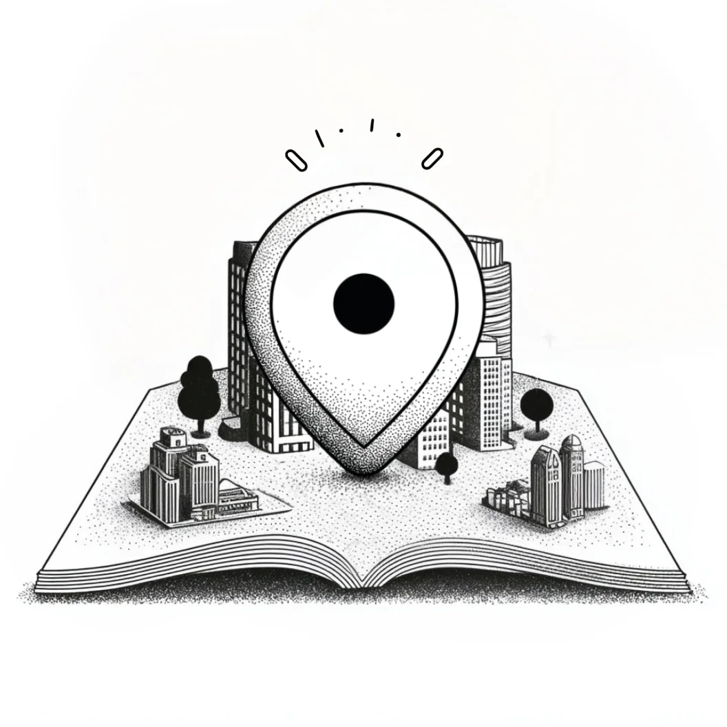
Ten Minutes, No Designer in the Loop
The output is a documented system, not a one-off illustration.
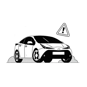
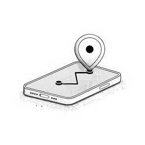
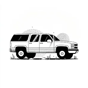
I documented the workflow in Figma. The asset bank holds more than a hundred illustrations across the spectrum. Marketing produces what marketing needs, product fills its own empty states, and the design team writes the system instead of staffing the queue.
Customer phrases became style characteristics, then a framework, then ten minutes of work anyone in the company could do.
How this came together
The steps, decisions, and tradeoffs behind it.
01·Discover
Mining customer language
Clean, accurate, not childish. Mature simplicity built on trust and accuracy.
02·Discover
Team curation workshop
Each participant presented three references and the room voted on the board.
03·Define
Writing illustration’s spec
I wrote four characteristics: tone, form, colour and light, character design.
04·Define
Mapping expression to UX
I matched each expression position to marketing, app, and product surfaces.
05·Develop
Style fit mapping
The team plotted every reference on brand fit and production fit, then voted.
06·Develop
Midjourney style hunt
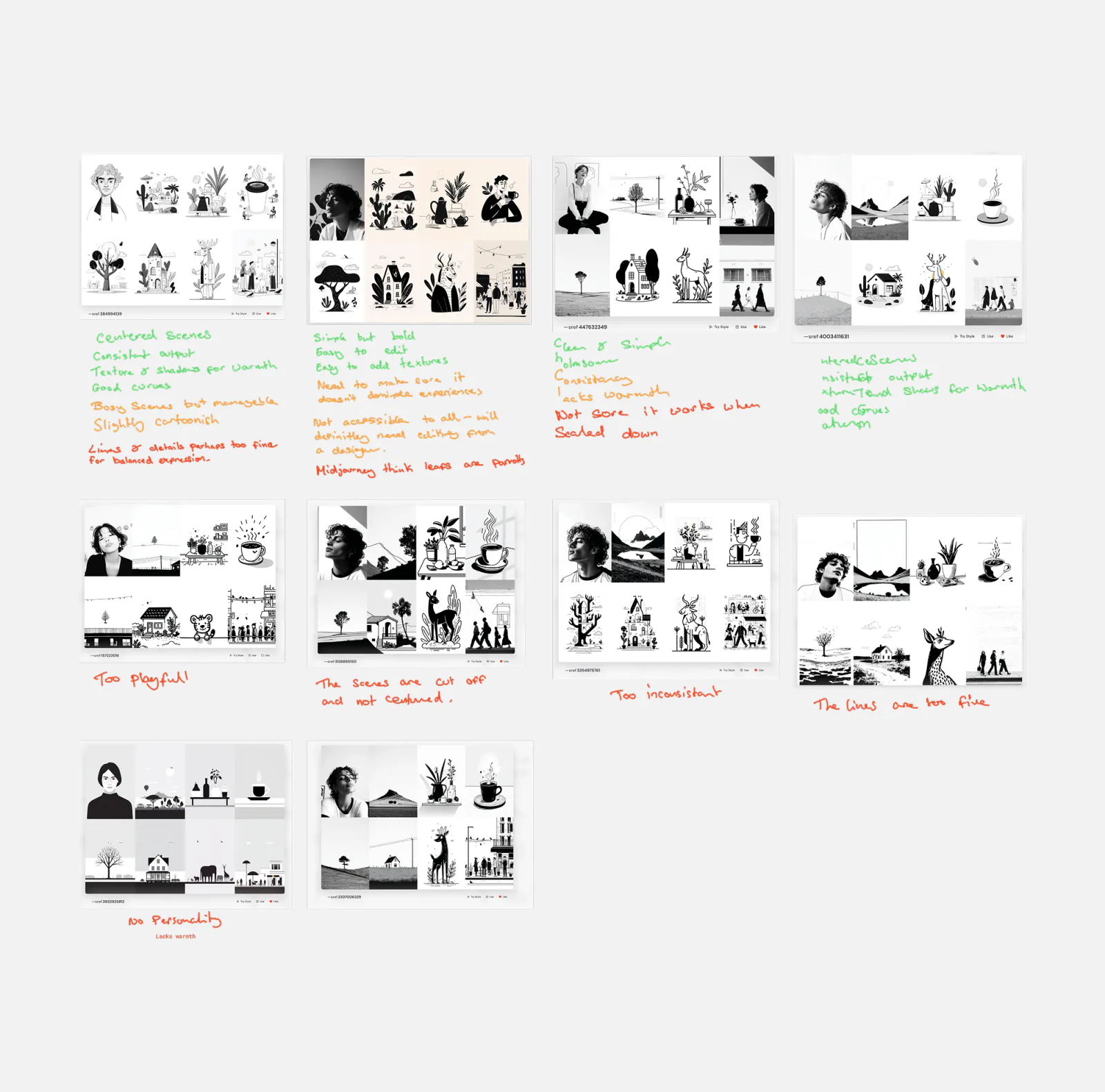
I searched Midjourney’s style library and found ten boards with reference codes.
07·Develop
Cutting ten to one
Four of ten candidates survived two criteria; I chose the one marked mature.
08·Deliver
Timing the workflow
I generated in Midjourney and refined in Figma, ten minutes total.
09·Deliver
Handing over the system
Three deliverables shipped: a workflow, guidelines, and an illustration bank.
Impact
Faster Production per Asset
Per-illustration time fell from multiple days to about ten minutes.
Asset Bank
More than a hundred on-brand illustrations now sit in a shared library anyone can pull from.

Unlocked Self-Serve Production
Marketing and product teams produce their own illustrations without routing through design.

Removed the Designer Bottleneck
The design team maintains the system instead of staffing an illustration queue.

Extended Brand Consistency
Four characteristics constrain every illustration the way the type spec constrains type.